Sherwin Williams Westhighland White
Article may have affiliate links. If you make a purchase, I may earn a tiny commission at no extra cost to you. Big thanks for supporting my small business.
Sherwin Williams Westhighland White SW 7566 is a beautiful creamy white with a slight warm undertone. It’s considered the most “off white” with a hint of gray to keep it from looking yellow.
Lets learn why Westhighland White is one of my favorite whites and how we used it in our entire house.

Moving into 2024, design trend experts are indicating a shift towards warm white from the popular cool toned “white” paint colors that we have seen over the last few years.
If you are looking for a neutral creamy white that is not a bright cool tone, then SW Westhighland may be for you!
What Undertones Does Westhighland White Have
What undertones are in Westhighland White?
SW Westhighland is a popular paint that has warm undertones but does not have yellow or beige undertones. It’s a classic neutral that has been popular for years and will be for many years to come.
The LRV or Light Reflective Value is 86 with pure white being 100.
Our living room has large windows allowing a lot of natural light and what I love about West Highland White paint is natural light does not wash out the color.

You will notice below, our foyer and dining room do not have as much natural light and the color still shows a true white color.
It almost casts a slight gray undertone in the image below.
Keep in mind, natural light plays a huge role in what colors will look like in your home.
For example, a North facing room will cast different lighting vs a Southern facing room.

If you have been following our Mediterranean home remodeling project, you know that we recently painted all of walls, trim and doors.
We eliminated all of the dark dated stained wood which has made me so happy! If you missed any of those posts, be sure to read:
You will notice above that the Westhighland White also stands strong (no yellow undertones) against our dark stained trim and flooring (see how we painted our wood trim and how our walls look with SW Westhighland trim color.)

Yes, we used the SW Westhighland White wall color on our trim but made it 25% lighter and it looks spectacular!
See the same view below with the trim color painted white.

The image above shows all of our trim painted SW Westhighland White but 25% lighter than the walls.

Our goal was to keep our trim color the same white as the walls but a little lighter to provide a slight contrast and added brightness. I am loving the white trim and the white doors!
If you are wondering, is Westhighland White yellow, absolutely not.
Is Westhighland White Darker Than Alabaster
SW Westhighland White is a shade darker than Alabaster but to be honest, it truly depends on the lighting in your home.
Natural light and artificial light (if your lamps are on) will cast a completely different shade and what looks “white” in my house, may not look white “in your house.”
Samplize peel and stick samples are an easy way to see a color in different rooms and lighting.
For example, Alabaster looked identical to Westhighland white paint in my house.
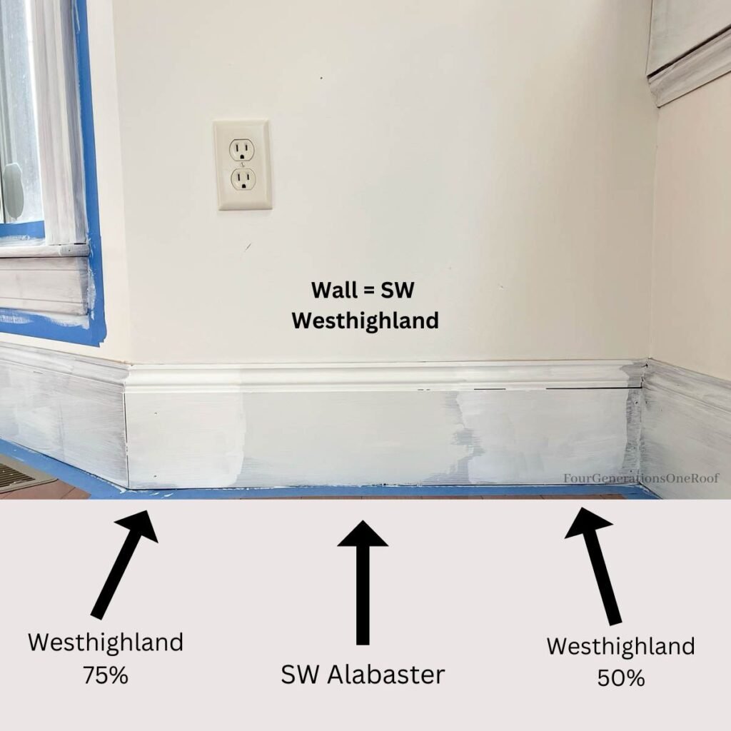
As you can see in the above image, SW Alabaster looked very similar to my wall color which is Westhighland.
You will notice the 75% arrow points to Westhighland at 25% lighter (the 75% means that I had the paint store dilute the color to 75% adding a 25% more white to brighten it up for my trim).
I know, very confusing! ha. I’ll write a blog post soon on how to change paint color percents.
The image below in this small guest bedroom makeover, we originally started with blue walls and opted to freshen up the room with Westhighland White and wow, what a difference!
If you have dark walls, be sure to click through this post, “how to paint over dark walls with white paint.”

Here is a good comparison that I made from the color swatches on the Sherwin Williams website that compares Westhighland vs Alabaster and Pure White being a bright white (the lightest of the 3).

Overall, my Sherwin Williams Westhighland Review is excellent. The color is the perfect neutral without feeling cold and is a great choice for walls, trim or kitchen cabinets.
If you are looking for cooler toned white that isn’t stark white, a great choice is Chantilly Lace by Benjamin Moore. We painted our entire lake house living room and kitchen Chantilly Lace and it’s so pretty!
Want to see how a color looks in your own space? Visit Samplize and order a large peel and stick sample! They are amazing samples and a much easier (and cleaner) way to do test swatches on your wall.
More Paint Color Review Posts
- Sherwin Williams Greek Villa (this was the perfect color for the entire inside of the ranch house)
- Best Grey kitchen cabinet paint colors (sharing the 7 paint grey cabinet colors with pictures)
- Sherwin Williams Westhighland White (a neutral white with a little warmth)
- Sherwin Williams Sea Salt (a beautiful blue green)
- Sherwin Williams Mindful Gray (the color we used in our kitchen renovation)
- Benjamin Moore Chantilly Lace (a cool white we used at our lake house)
- Benjamin Moore White Dove (see how we used this color in our waterfront home and a small cape style house remodel from 1950.
- Behr Polar Bear (in our pool house with a coastal vibe)
- Behr Whipped Cream (perfect neutral for large open spaces or dark rooms with no windows)
- Benjamin Moore Advance Paint (best kitchen cabinet paint)
Latest Blog Posts

Meet Jessica
What started as a hobby, Jessica’s blog now has millions of people visit yearly and while many of the projects and posts look and sound perfect, life hasn’t always been easy. Read Jessica’s story and how overcoming death, divorce and dementia was one of her biggest life lessons to date.


love the white trim and walls! do you use flat or egg shell sheen for walls and semi gloss for doors? what sheen for baseboard trim do u use? thank you Linda kraner
Thank you! We used eggshell for the walls and satin on the doors and trim. Semigloss has too much of a sheen for me 🙂
Looks great! I like what you did with the trim.. I’m finding each line (emerald, proclassic etc) has a different white base though so when you lightened it, which paint did you use on your trim? Thanks!
THanks! We actually used Benjamin Moore base (regal select) and a sherwin william color. THey share color codes in their system so you can swap base paints and colors between brands 🙂 Our painter uses Benjamin Moore and that is what we went with but we have used SW emerald on several of our other projects and the emerald base is amazing too.
What ceiling color did you use to match Westhighland White? I am liking your idea of lightening it by 25% for the trims and doors.
the ceiling was already painted from the prior owner so I’m not 100% sure but we have painted many home interiors and benjamin moore Chantilly lace is not a stark white (like typical ceiling white) and does a good job of providing a nice bright ceiling but white dove is a little warmer (also a great white for ceiling) if you don’t want that “bright” white high contrast look between the walls and ceiling.
Jessica, what color paint did you use for your ceiling with Westinghouse White?
I believe it’s called “pure white” by sherwin williams