

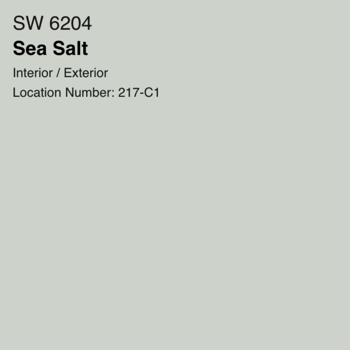
Sherwin Williams Sea Salt 6204 Paint Color Review
Article may have affiliate links. If you make a purchase, I may earn a tiny commission at no extra cost to you. Big thanks for supporting my small business.
I love blue green colors and today, I’m sharing some of my favorites! Sherwin Williams Sea Salt SW 6204 is a beautiful blue green color with a slight blue gray undertone. Be sure to read to the bottom because I am showing you several styled and decorating rooms on how Sea Salt stacks up in bedrooms, bathrooms, living rooms and dining rooms!
Choosing a paint color always feels like speed dating, doesn’t it? You line up ten swatches, stare at them from across the room, and suddenly realize the soft gray you loved in the store is giving you mint toothpaste vibes at home.
That was me with Sherwin Williams Sea Salt. It sounded dreamy on paper, but I quickly learned this shade has a personality of its own, sometimes green, sometimes blue, sometimes gray.
AND…. honestly, that’s what makes it so fun (and tricky)!
If you’re looking for a color that will give your room a refreshing and calming feel, then you should try Sherwin Williams Sea Salt.
Sherwin Williams Sea Salt 6204
This popular color has gained a reputation for being a go-to shade for DIY projects, and for a good reason.

Let’s take a look at why people are raving about Sea Salt and guide you on how to incorporate this color into your home.
Sea Salt Features and Stats:
- The LRV of Sea Salt is 63
- Color family is green
- Brightens up a space
- Cool color tone
Paint Tip: What is LRV?
An LRV (light reflectance value) of 63 means that the light reflectance will help make the space appear bright.

LRV is based on a scale of 0 to 100 with zero absorbing all the light and 100 reflects all light (provides brightness).
If a room is naturally very dark, a color with an LRV at 100 or close to 100 will help brighten the room.
Is Sherwin Williams Sea Salt More Blue Or Green?
Sea Salt Sherwin Williams is a pale blue-green hue that has gained a lot of popularity in recent years.
It’s more of a green color (almost green gray) but depending on the lighting, the tone can change making it appear blue.
The color overall has a cool undertone creating a beautiful green gray undertones.

Is Sherwin Williams Sea Salt Warm or Cool?
Sherwin Williams Sea Salt is a green cool toned color with a grey undertone.
Be fair warned though, depending on the time of day, the color will look different.

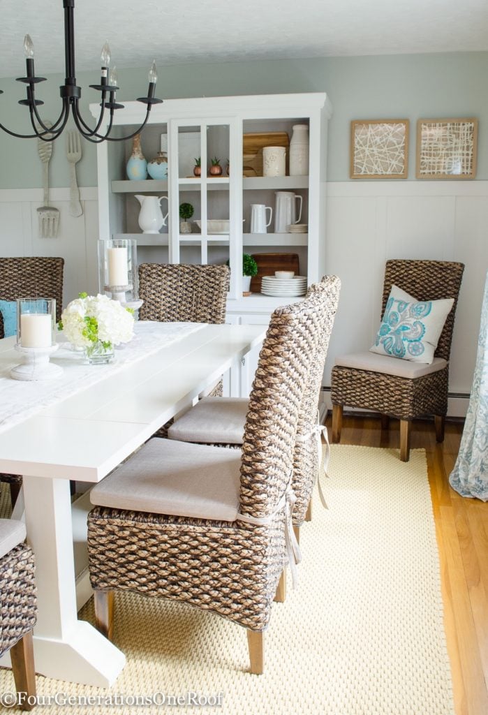
SW Sea Salt Dining Room

We used Sea Salt in our dining room and kitchen which shows as a blue gray due to the natural light. Sea Salt is a true chameleon color that changes based on lighting.

Sherwin Williams Sea Salt Living Room & Kitchen
Below, you will see how my friend Kim at Sand and Sisal used Sherwin Williams Sea Salt in her living room. The color has green tones in her home vs my home.
This is also a good example of how lighting situations will dictate the green undertones.

I love how her white cabinets in the kitchen coordinate with sea salt as well.
What Colors Go With Sherwin Williams Sea Salt?
Accent Walls and Accessories
Coordinating colors like SW Spare White, SW Summit and SW Agreeable Gray all offer a nice contrast to sea salt providing visual interest and character to a room.
If you are looking for completely different colors that coordinate, try SW Smoky Salmon which is a beautiful pinkish tone, SW Iron Ore which is a great black but not “in your face” kind of a black, SW Hale Navy with is a gorgeous blue color and SW Fleur De Sel which is a light gray.
Coordinating Trim Colors
A simple white trim, like pure white or extra white, is all you need to really make this paint come together as it sets off its calming effects nicely.
Lighting Conditions
Lighting plays a big role in color tone so be sure to buy a paint swatch to see the color in your space during different times of the day.
One of the biggest considerations when picking a paint color is to take into effect which direction the room faces.
Cardinal Directions
North-facing rooms do not receive much light. Meaning, the sun doesn’t directly shine inside so the room receives less warm light where South-facing rooms tend to get direct sunlight and have an abundance of natural light throughout the day.

East-facing rooms are usually brighter in the morning and West-facing rooms have the most natural light towards the end of the day as the sun is going down.
Artificial Light & Bulbs
Test the paint color Day and Night!
Sea Salt is the definition of a color chameleon. Snap a picture of your walls in the morning, afternoon, and evening, you’ll be shocked at how much it shifts.
In my dining room, it leaned soft green over coffee, bluish-gray by dinnertime, and almost silvery once I turned the lamps on. Knowing this ahead of time makes it easier to choose the right bulbs and accents.
Artificial lighting will no doubt, change the look of your paint color so choosing a light bulb that will enhance your color is important.
I cannot tell you how many times I have come home with the wrong lightbulb and discovered my room and new paint color looked horrible!

It wasn’t until I learned a little trick from an employee at Home Depot that I had an “ahhh haaa moment.”
Lumens has a great tutorial on how to pick the right bulb so if you are confused, read head to this blog post.
Basically in a nut shell, the lower the Kelvin number of the bulb the more yellow the light cast will be. The higher the Kelvin number, the brighter white the color will be.
So when you purchase a light bulb, look at the number on the box!
2500-3500K Light Bulbs
These bulbs will give off a warm yellow tone and typically work well with warm toned paint colors. As you get closer to 3500 range, the warmth lessens but is still considered warm.
3500+ range gets cooler the higher you go and cool toned paint like sea salt, looks brighter and crisper.
I personally have 3500 bulbs throughout the house and find it’s a happy medium between warm and cool but have 4000 in our basement because of how dark it is.
Using Decor To Tone Down Sea Salt
If you inherited Sea Salt wall color because you just bought the home and well, it’s already there, here are some tips to accentuate or tone it down.

My Christmas dining room above showcases exactly how pairing white trim is the best white to coordinate with Sea Salt.
To Emphasize the Green Side
- Pair with neutral tones like Urbane Bronze, Repose Gray, or Intimate White
- Layer in natural materials like jute rugs, rattan baskets, raw wood tones (this is what I did in my dining room!)
To Warm It Up
- Add coral, gold, or muted red accents through pillows or art
- Sherwin Williams Blonde works great in a foyer with Sea Salt
To Cool It Down
- Bold accents like Hale Navy, Naval, or Iron Ore calm the green undertones
- Black frames or a Tricorn Black accent cabinet can ground the room
What To Avoid
I personally do not like creamy whites with Sea Salt. Muddy browns can also make Sea Salt look muddy or pinkish. Eider White, for example, often reads pink against it. Stick to crisp whites instead!

My hutch above is also a piece that I painted the same color as the trim and wainscotting in the dining room to accentuate the Sea Salt upper walls.
Why Is Sea Salt Is Popular?
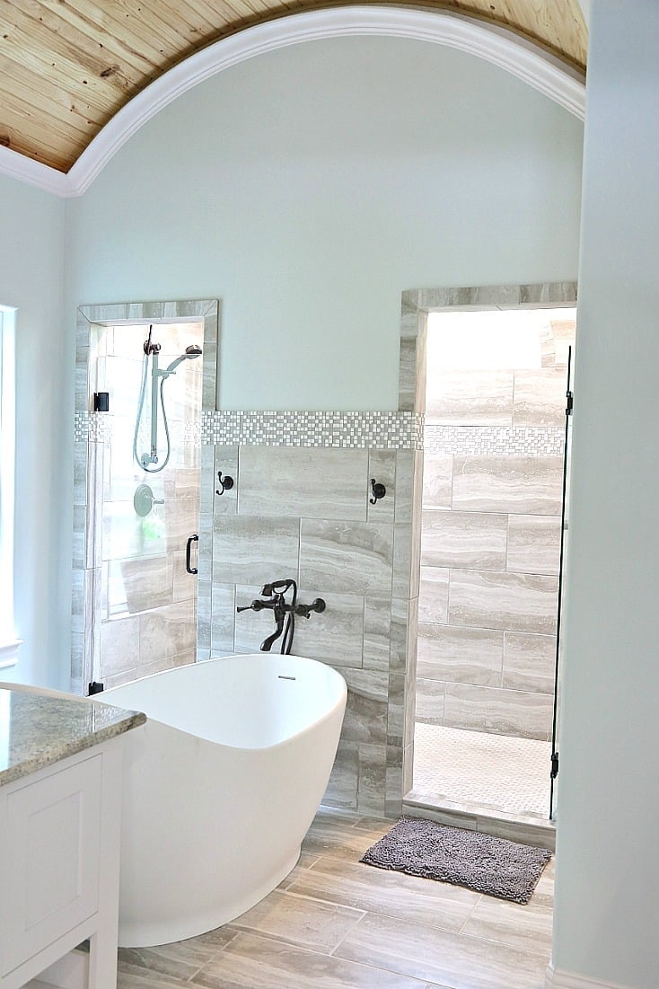
Where does Sea Salt work best? Typically, bathrooms, bedrooms, hallways and living rooms. Mostly because it feels relaxing and calming but as you can see above, it really can be used anywhere.
This particular bathroom below shown at my friend Cindy’s blog shows perfectly how Sea Salt is a perfect bathroom color.
Here are some of the most popular reasons why it’s so popular:
- Versatility: Sea Salt is a versatile color that can work well in a variety of different spaces
- Calming Effect: The soft, muted tones of Sea Salt can create a calming and relaxing atmosphere in a room
- Complementary with Natural Elements: Sea Salt pairs well with natural wood tones and works well with both light and dark wood furniture pieces. It also complements accessories that are made of natural fibers such as jute, sisal, and rattan.
- Timelessness: Sea Salt has a timeless quality that still looks fresh and modern
Sea Salt Color Comparison
Now that we have determined all the features and benefits of Sea Salt, I wanted to show you how it compares to 2 of my other favorite blue green colors, Topsail and Rainwashed.
My friend Kim’s living room above is picture perfect featuring Sea Salt with natural ratan and seagrass elements.
If you are anything like me, you think you love one color because it looked great online in someone else’s home. I would highly recommend you sample these two other colors below along with Sea Salt.
SW Sea Salt vs. SW Topsail
Sherwin Williams Topsail is more of a green blue color where Sea Salt is more green. Honestly though, they are both similar and lighting will play a big role in the color tone.
SW Topsail in our lake house bedroom below is blue shade with a green undertone.

SW Sea Salt vs SW Rainwashed
SW Rainwashed is a blue green paint color and a little darker than Sea Salt and does not look “gray” like sea salt.
As you can see below in our previous homes living room, the SW Rainwashed gives off a deeper greenish blue hue.
If you are looking for a blue green color that will give the best pop of color and not appear gray, Rainwashed may be the perfect color for you!

Below is a comparison of the three colors:

Why You Need To Buy A Paint Sample
Paint Color Selection Tip:
Purchase a Sherwin Williams Sea Salt sample and tape it on your wall for a couple days and see how it looks during artificial and natural light. It’s worth the few bucks to make sure you like the paint color!
Sea Salt Overview
Sherwin Williams Sea Salt is my go-to for a calm, coastal vibe in the bathroom, bedroom, guest room, kitchen… it works everywhere. Pair it with seagrass, sisal, and warm beige, and suddenly you’re living in a magazine spread.

It’s a soft green-gray that plays nice (as shown above in my laundry room) with just about anything, and Sherwin Williams paint will keep it looking fresh for years.
And please, don’t skip samples! Grab the peel-and-stick swatches from Samplize, slap ’em on the wall, and check them in every light before you commit. Your future self will thank you.
Want to see how this color looks in your own space? Visit Samplize and order a large peel and stick sample of Sea Salt! They are amazing samples and a much easier (and cleaner) way to do test swatches on your wall. 😉
Common FAQ’s
Sea Salt is primarily a green color (almost green-gray), but depending on the lighting, it can appear blue. It has cool undertones that create a blue-green chameleon effect — looking green during the day and more blue-gray in artificial light at night.
The LRV (Light Reflectance Value) of Sherwin Williams Sea Salt SW 6204 is 63. This means it reflects a good amount of light and will help brighten a space without being too light or washed out.
Sea Salt is a cool-toned color with a gray undertone. It belongs to the green color family but reads differently depending on lighting — it can shift between green, blue, and gray throughout the day.
Coordinating colors include SW Spare White, SW Summit, and SW Agreeable Gray for contrast. For bolder pairings, try SW Smoky Salmon (pinkish tone), SW Iron Ore (soft black), SW Hale Navy (deep blue), or SW Fleur De Sel (light gray). For trim, use Pure White or Extra White.
Sea Salt works well in bathrooms, laundry rooms, dining rooms, kitchens, and living rooms. It gives rooms a refreshing, calming feel. Just be aware that it will look different in each room depending on the natural light direction — north-facing rooms pull out the gray, south-facing rooms pull out the green.
More Paint Color Review Posts
- Sherwin Williams Greek Villa (this was the perfect color for the entire inside of the ranch house)
- Best Grey kitchen cabinet paint colors (sharing the 7 paint grey cabinet colors with pictures)
- Sherwin Williams Westhighland White (a neutral white with a little warmth)
- Sherwin Williams Sea Salt (a beautiful blue green)
- Sherwin Williams Mindful Gray (the color we used in our kitchen renovation)
- Benjamin Moore Chantilly Lace (a cool white we used at our lake house)
- Benjamin Moore White Dove (see how we used this color in our waterfront home and a small cape style house remodel from 1950.
- Behr Polar Bear (in our pool house with a coastal vibe)
- Behr Whipped Cream (perfect neutral for large open spaces or dark rooms with no windows)
- Benjamin Moore Advance Paint (best kitchen cabinet paint)
Meet Jessica
What started as a hobby, Jessica’s blog now has millions of people visit yearly and while many of the projects and posts look and sound perfect, life hasn’t always been easy. Read Jessica’s story and how overcoming death, divorce and dementia was one of her biggest life lessons to date.
Can you provide the curtains you have in the photo with the SW Sea Salt? Thanks.
Hi, those are curtains that I made 🙂