

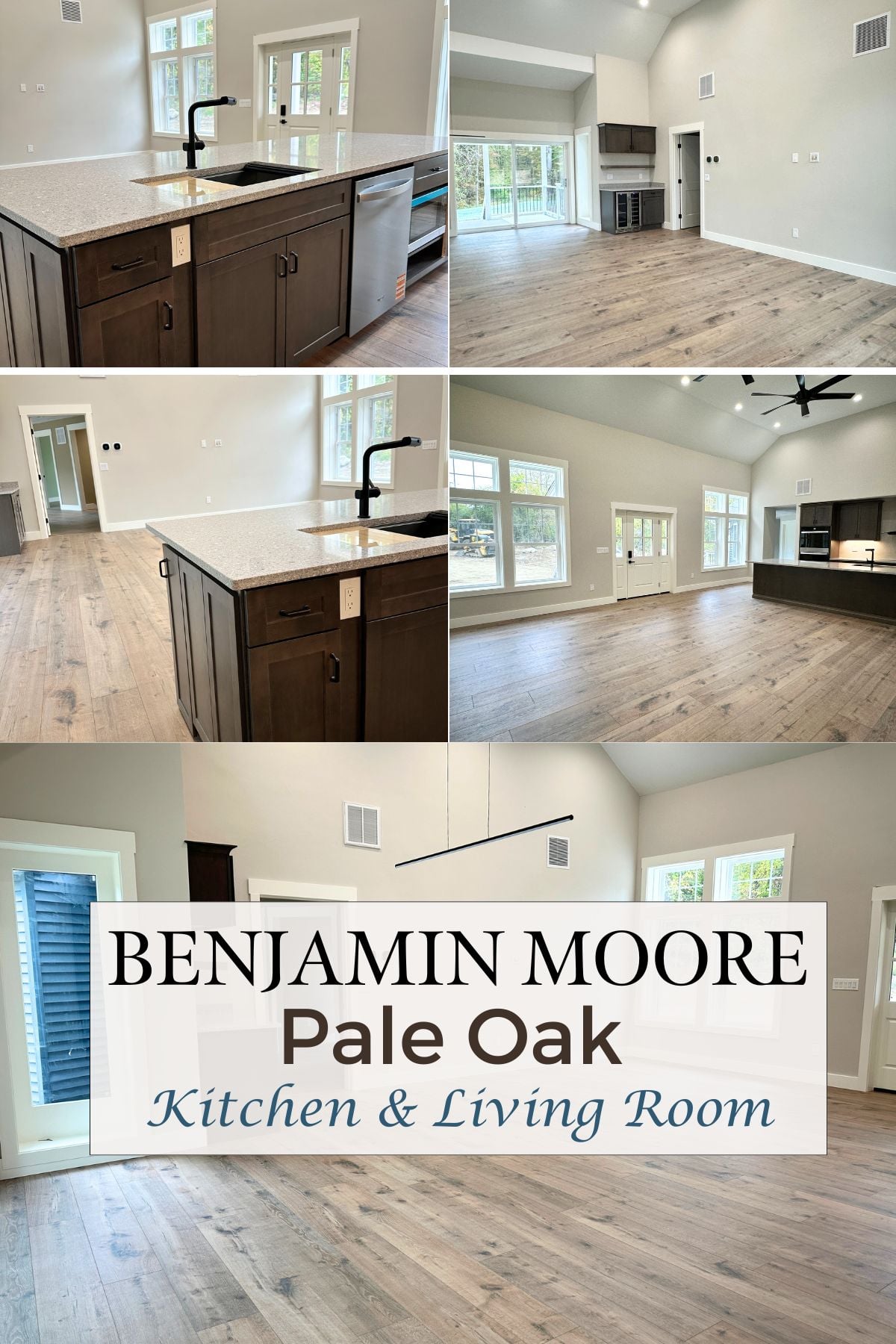
Benjamin Moore Pale Oak Walls: Perfect Neutral For Kitchen & Living Room
Article may have affiliate links. If you make a purchase, I may earn a tiny commission at no extra cost to you. Big thanks for supporting my small business.

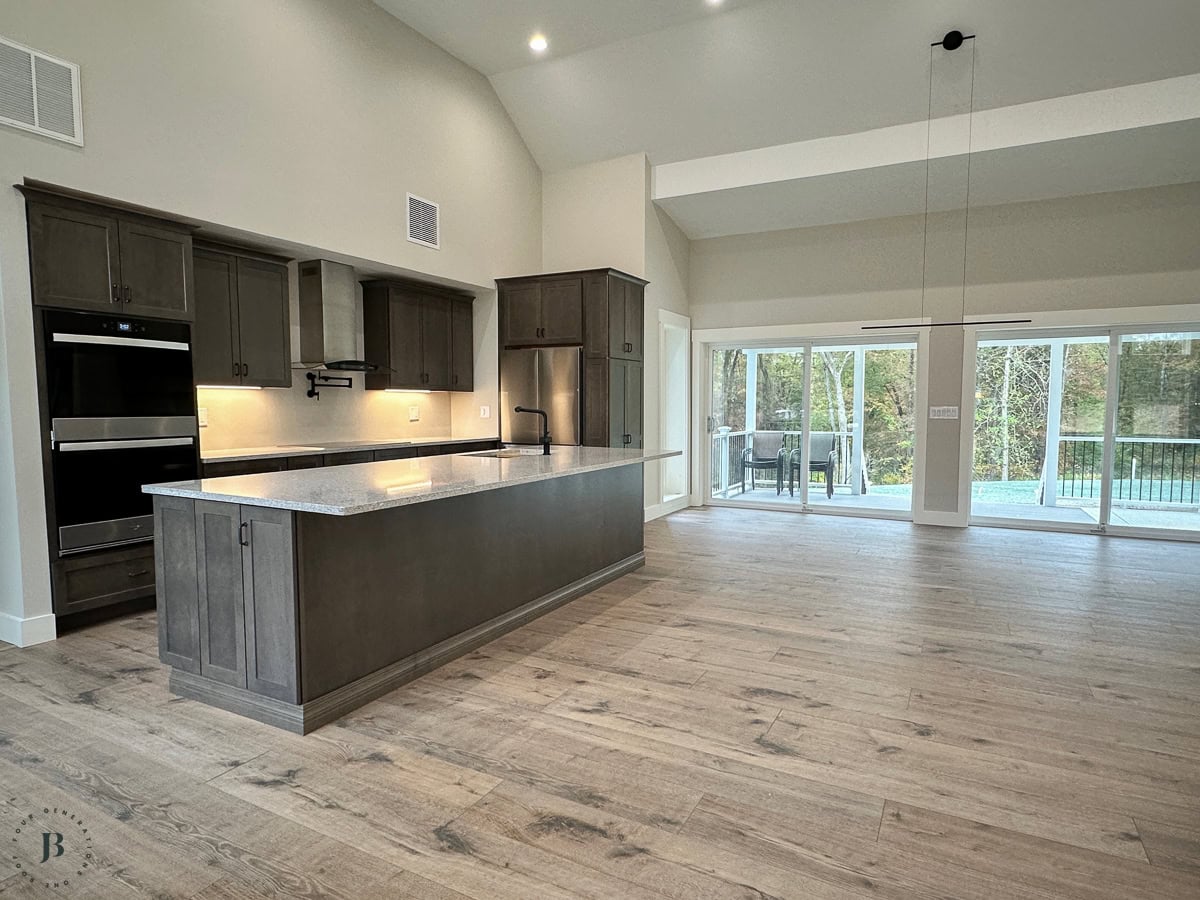
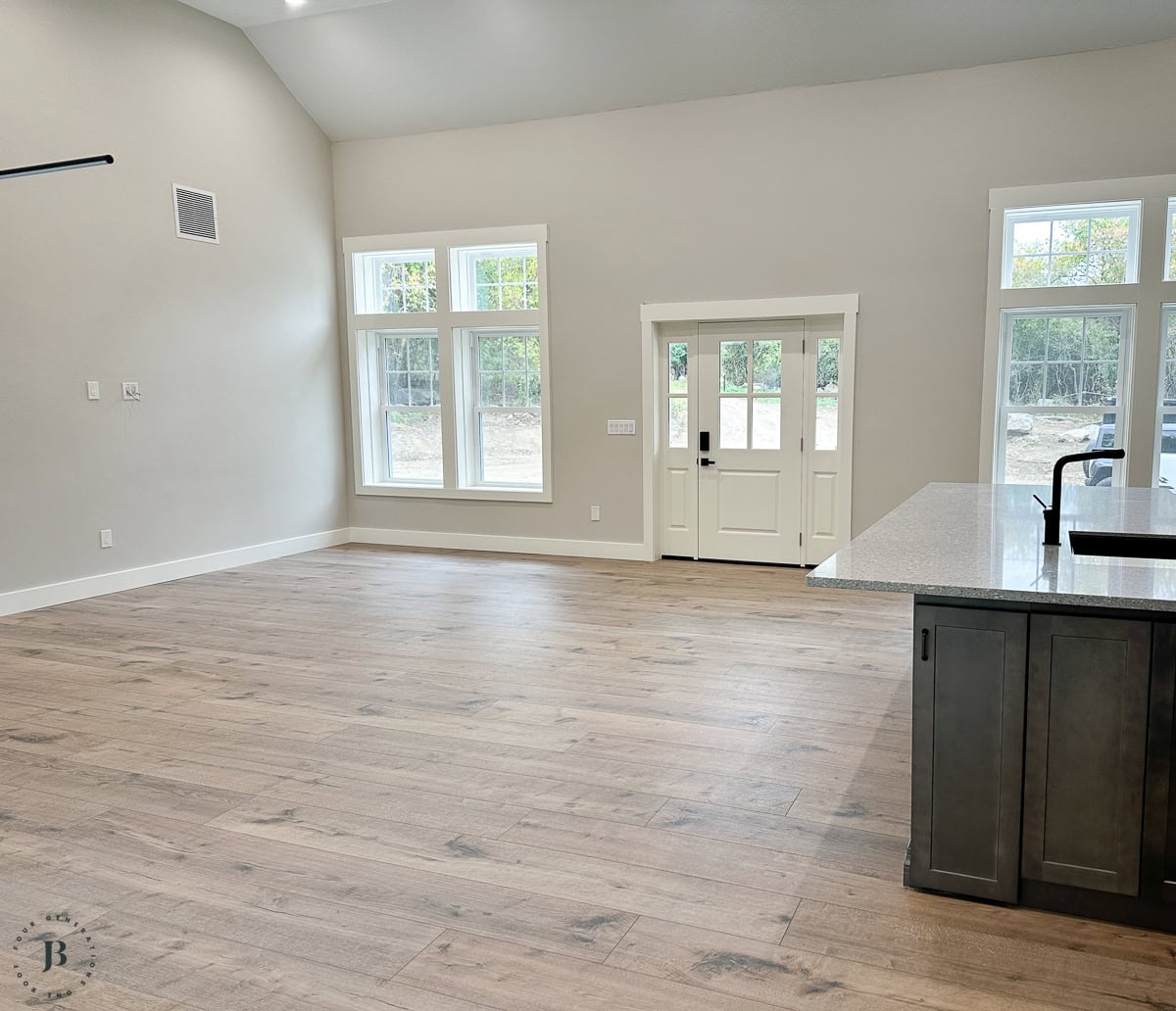
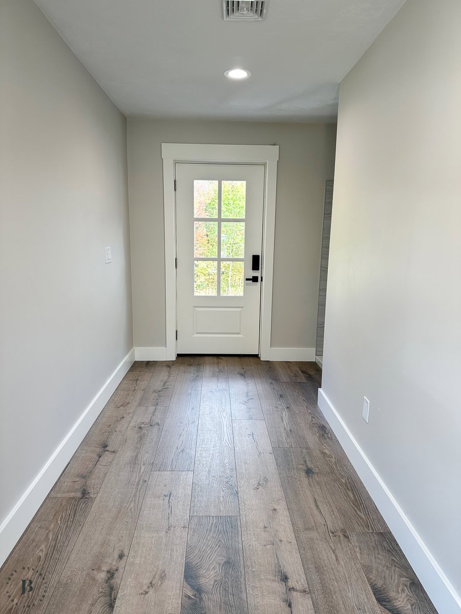
Remember the multigenerational house Jim wrapped up last year? The shared kitchen and living room featured Benjamin Moore Pale Oak and it turned out to be the perfect neutral color that both families loved.
The challenge with shared spaces is trying to find a color that everyone likes. Each couple picked their own color palette and feel for their private wing. But the shared kitchen and great room? That space had to work for everyone.
The clients needed a color that could sit between two warm palettes and make the whole house feel like it belonged together — without either side feeling like they compromised.
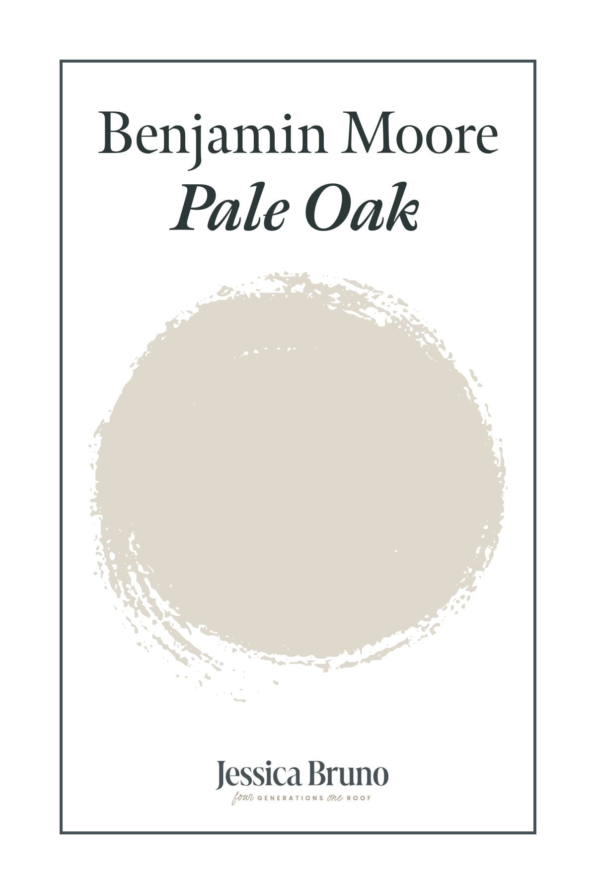
Benjamin Moore Pale Oak (OC-20) was their choice. And it nailed it.

What Is Benjamin Moore Pale Oak?
Pale Oak is a greige — that’s the hybrid between gray and beige that the design world can’t stop talking about.
The Benjamin Moore color code is OC-20, and it’s part of their Off-White Collection.
Don’t let “off-white” fool you though.
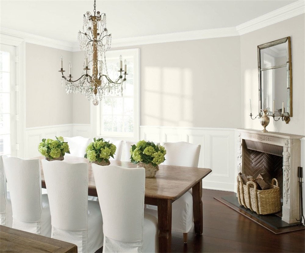
On the wall, Pale Oak reads as its own distinct color. It’s not white. It’s not beige. It’s not gray. It lives right in the space between all three — and that’s exactly what makes it so useful.
Benjamin Moore describes Pale Oak as having “warm gray undertones that conjure the quiet majesty of white oak.” It’s a soft, warm neutral that shifts depending on your light.
In bright, south-facing rooms it can read almost like a creamy off-white.
In north-facing or lower-light spaces, it picks up more gray and depth.
Same color, two completely different vibes.
Here’s the thing about Pale Oak, it has a subtle pink or purple undertone that can show up depending on your lighting and surrounding elements.
It’s not dramatic but it IS there. If you’re sensitive to pink tones, this is worth paying attention to before you buy.
What Is the LRV of Benjamin Moore Pale Oak?
LRV stands for Light Reflectance Value.
It’s the measurement designers use to figure out how light or dark a paint color actually is on a scale from 0 (pure black) to 100 (pure white).
Source: Benjamin Moore
Pale Oak’s LRV is 68.64.
That puts it solidly in the “light” category. In real terms, that means it reflects enough light to keep a room feeling bright and open without washing out the way a stark white would.
It adds warmth without adding heaviness which is exactly what you want in a space that needs to feel welcoming to multiple families.
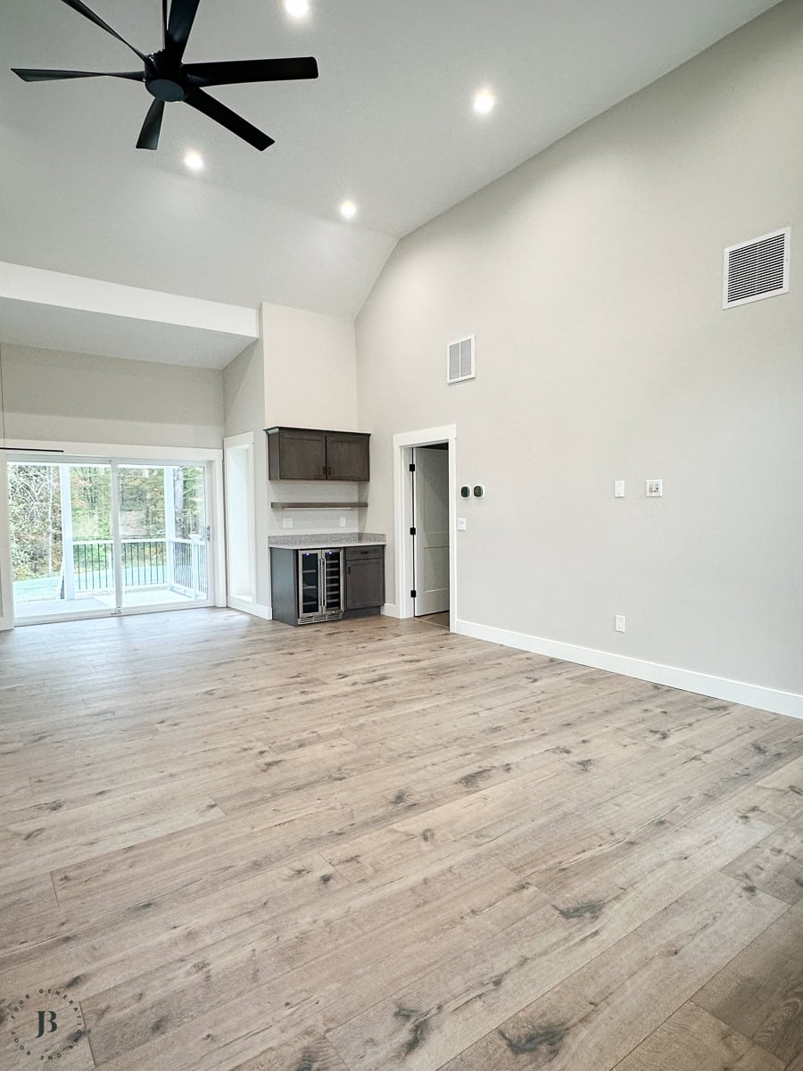
For the shared great room in the twin brothers’ house, that LRV was a big part of why it worked.
The space needed to feel open and airy without competing with the warm accent colors coming from either wing.
Pale Oak did exactly that, it reflected the light beautifully and let everything else in the room do the heavy lifting.
One thing to keep in mind: if you’re working with a darker room or limited natural light, Pale Oak will lean grayer and moodier.
That’s not necessarily a bad thing, it just means the color is doing more work. In that case, pair it with lighter trim and let the furniture and textiles add the warmth.
Why Pale Oak Worked So Well in This Build
Here’s the thing about a multigenerational build — the shared spaces can’t be an afterthought. They’re the connective element of the whole house.
On this project, the fixed elements set the tone before paint was even in the conversation.
The clients chose brown kitchen cabinets and brown-toned hardwood flooring throughout the shared space, two different browns, both warm.
Which meant the wall color had to coordinate with both without blending into either one. Too dark and it disappears.
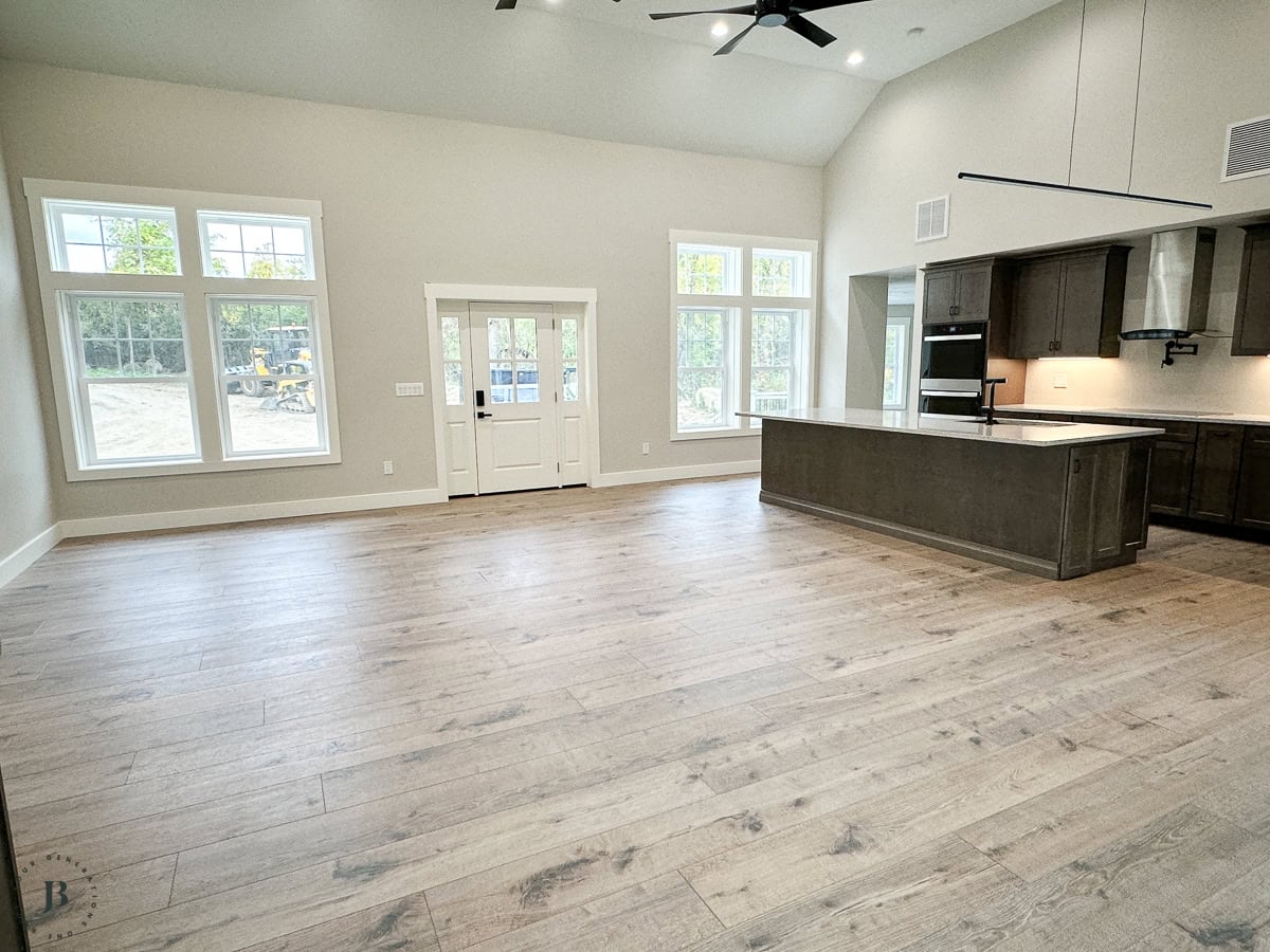
Too light and it washes out against all that warmth. Too cool and the whole room starts fighting itself.
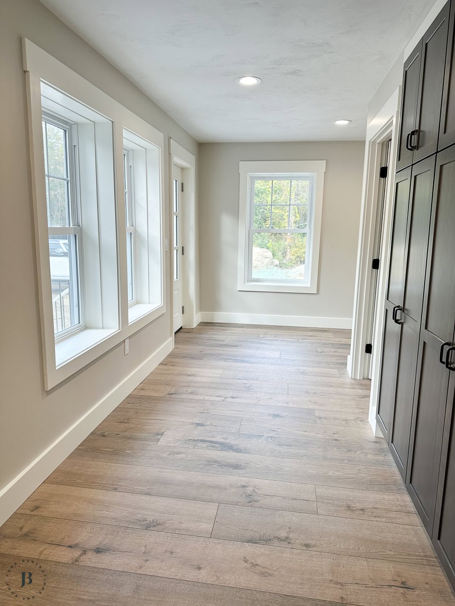
Benjamin Moore Pale Oak Living Room — How It Looks in a Shared Space
One of the most common questions about Pale Oak is whether it actually works in a living room or great room. Yes. It’s one of the best colors for open-concept spaces — and here’s why.
Pale Oak has enough depth to feel like an actual color choice rather than “we just didn’t paint.” But it’s light enough (LRV 68.64) that it doesn’t close a large room in.
The key in a shared space: let the color be the unifier, not the focal point and let the furniture and decorative accessories add color and texture.
Benjamin Moore Pale Oak Color Palette: The Best Colors to Pair With It
Pale Oak is genuinely one of the most versatile neutrals out there but “versatile” doesn’t mean “throw anything at it.”
There are combinations that work beautifully and combinations that will make you cringe.
Here’s what actually pairs well, based on what we’ve seen on real walls in real houses.
The Trim Color: Why They Skipped Stark White
This is where this project got interesting — and where it breaks from the usual advice you’ll find online.
The clients didn’t want a stark white on the trim.
With brown cabinets, brown floors, and Pale Oak on the walls, a bright crisp white would have felt too sharp, like one element in the room was trying to be the star while everything else stayed warm and grounded.
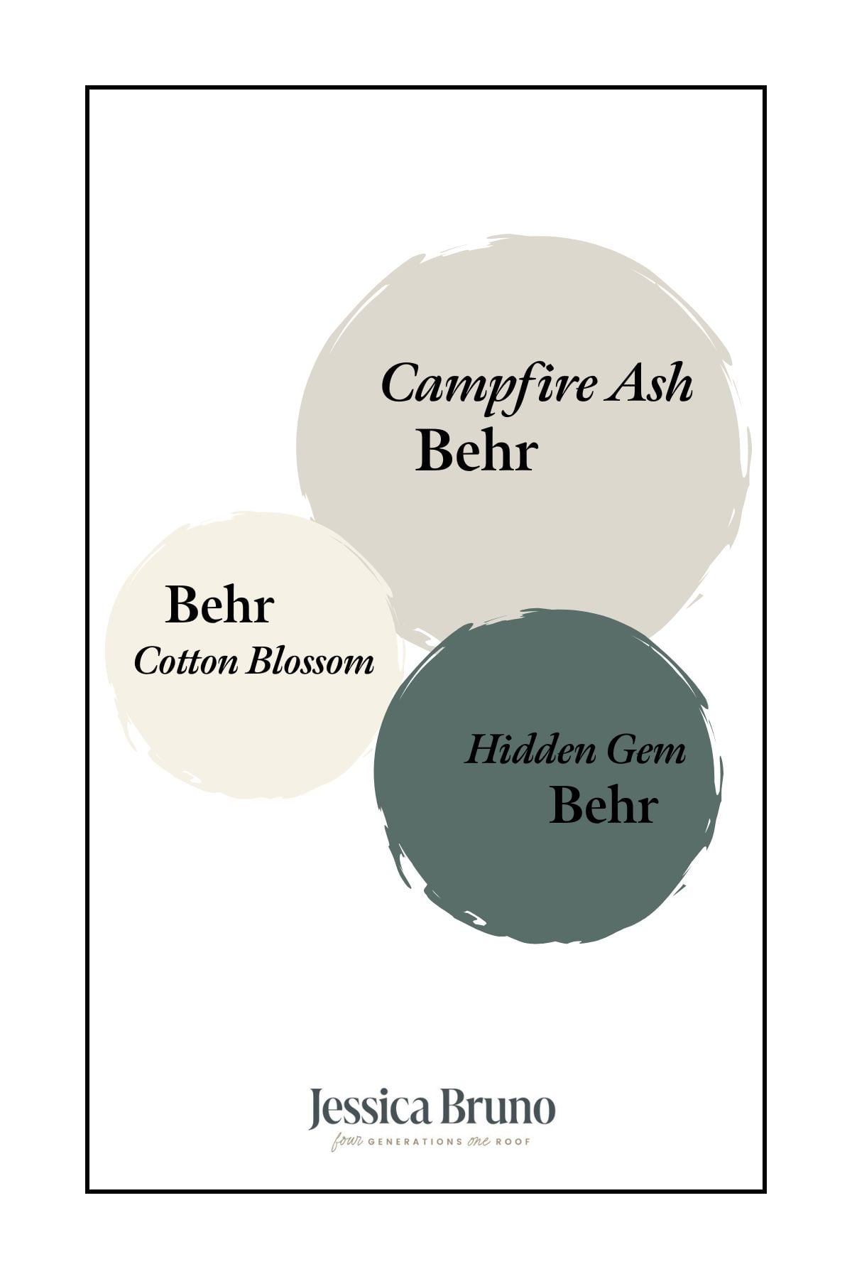
So they went a neutral white that had a hint of warmth.
Behr Cotton Blossom (BWC-07) — a warm cream-white with a whisper of cream undertone and an LRV of 87.71.
It’s not quite white, not quite cream — it sits right in that middle ground that keeps things feeling soft and cohesive without disappearing into the walls.
Against Pale Oak, it reads as a gentle step lighter rather than a hard contrast line, which is exactly what tied the whole warm palette together without any single element fighting for attention.
Now, if you ARE going with a true white trim on Pale Oak, the best options are Benjamin Moore Chantilly Lace (OC-65) for a crisp clean look, or White Dove (OC-17) if you want something softer.
What to avoid: whites with strong yellow undertones like Simply White or Snowfall White. The yellow can clash with Pale Oak’s subtle pink undertone and make both colors look slightly off. You’ll notice it immediately if you sample them side by side.
Accent Colors That Work With Pale Oak
Blues: Hale Navy is the classic pairing — it pops against Pale Oak’s warmth without clashing. Wedgewood Gray is a softer option if you want something less dramatic.
Greens: Healing Aloe and Smoky Green both look stunning with Pale Oak. They pull out the gray in the greige and keep things feeling fresh and grounded.
Deeper neutrals for contrast: Wrought Iron (2124-10) as an accent door color or built-in finish creates a gorgeous contrast against Pale Oak walls. Chelsea Gray works if you want something moodier but not quite as dark.

Wood Tones
Pale Oak is one of the best paint colors for homes with warm wood. Light oak, medium walnut, natural wood finishes are all gorgeous. It’s not ideal with cherry or mahogany (the pink undertone can clash with those reds), but for anything in the oak-to-walnut range, it’s close to perfect.
The brown cabinets and floors in the twin brothers’ house are a good example — Pale Oak sat right alongside those warm browns without getting lost.
Tips Before You Paint
A few things that stood out from this project — and from watching color decisions play out across other paint projects:
Sample it in your actual space. This one can’t be stressed enough. Pale Oak shifts dramatically depending on light. Paint a large swatch at least 2 feet by 2 feet and move it around the room at different times of day. Grab your mess free paint swatches here!
Morning, afternoon, evening. They will all look different!
Watch the undertone. If you’re sensitive to pink, pay attention to how Pale Oak reads in your specific lighting. Warm, south-facing light tends to keep it in the taupe/beige family. Cooler or north-facing light is where that pink undertone shows up more. Neither is wrong — just make sure you know what you’re getting before you commit.
Think about your fixed elements first. Flooring, tile, countertops — these don’t change. Make sure Pale Oak works with what’s already in place before you start rolling.
Is Benjamin Moore Pale Oak Right for Your Home?
If you’re looking for a neutral that feels warm without feeling beige, works in open-concept or shared spaces, pairs beautifully with wood tones and warm accent colors, and keeps a room feeling light and airy — Pale Oak is worth sampling. It’s Benjamin Moore’s best-selling non-white color for a reason. It genuinely works in a wide range of homes and lighting situations.
Have you used Benjamin Moore Pale Oak in your home? I’d love to see how it turned out — drop your photos in the comments below!
Planning a multigenerational build or renovation and trying to nail down colors? I put together a guide with everything I wish I’d known before our first multigen house. Grab it here
Meet Jessica
What started as a hobby, Jessica’s blog now has millions of people visit yearly and while many of the projects and posts look and sound perfect, life hasn’t always been easy. Read Jessica’s story and how overcoming death, divorce and dementia was one of her biggest life lessons to date.